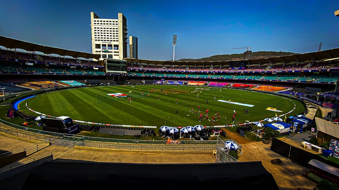
Stadium design is no longer just about seat count, sightlines, and premium lounges. The new frontier is fan flow: how people actually move through a venue from gate to gate, concourse to concourse, and restroom to concession stand. When operators read movement maps correctly, they can redesign matchday operations to reduce congestion, speed up purchases, improve safety, and unlock measurable revenue uplift. That is the practical promise behind movement intelligence, and it is reshaping how modern venues think about venue optimization and the overall fan experience.
The best sports organizations are already moving from gut feel to evidence-based decision-making, much like the case-study approach described by ActiveXchange’s success stories and testimonials. The lesson is simple: if you can see where fans slow down, cluster, reroute, or abandon a purchase, you can design better entry systems, place concessions more intelligently, and plan staffing with much greater precision. For venue teams, that means stadium operations should be treated like a live network, not a static building. And for fans, it means shorter queues, less friction, and a better day out.
In this guide, we break down how movement maps translate into concrete decisions across the fan journey. We’ll cover entry design, concourse planning, concession placement, restroom access, egress strategy, premium areas, data capture, and the operating rhythm needed to keep improving over time. We’ll also connect those ideas to adjacent playbooks on weather risk for VIP events, camera-based analytics, and predictive operations-style thinking where forecasting demand matters as much as reacting to it. If you run a venue, this is the operating system for smarter matchday decisions.
1) What movement maps actually show—and why stadium design teams need them
From static blueprints to living behavior
A blueprint tells you where a gate, aisle, or concession stand exists. A movement map tells you whether people use it, avoid it, or overload it. That distinction matters because real matchday behavior rarely matches architectural intent. Fans arrive in waves, pause for tickets and security, split into social groups, detour for food, and return at different tempos depending on the score, weather, and opponent profile. Traditional stadium design captures the shell; movement intelligence captures the pulse.
For operators, movement maps reveal bottlenecks that are invisible in planning meetings. A wide concourse can still fail if one turnstile bank feeds it too slowly, or if a beverage kiosk creates a standing cluster right at a decision point. This is where insights from structured visibility systems and dual-format content thinking are surprisingly relevant: you need the right layers of data presented in a way staff can act on quickly. In venue terms, the most useful map is not the prettiest one; it is the one that clarifies where people stop, accelerate, turn back, or queue.
Why behavior beats assumption
Many venues still over-index on assumptions: “Fans will use the closest gate,” “people will buy food at halftime,” or “premium guests won’t use the main concourse.” Movement data often disproves these beliefs. Fans choose routes based on crowding, shade, signage clarity, view lines, restroom proximity, and even where their friends are already standing. The most valuable design changes come from seeing the mismatch between intended use and actual use.
That is exactly why the case for data-led venue planning keeps growing across sports and recreation sectors. ActiveXchange’s client stories show how organizations use movement data to strengthen decision-making, just as a broader evidence-based planning culture would in a city, campus, or community facility. The same logic applies to arena fit-outs: if fans constantly detour around a point of compression, the issue is not “fan behavior,” it is design friction. Once you understand that, the fix becomes operational, architectural, or both.
The metrics that matter most
The most actionable movement maps typically track arrival timing, dwell time, heat density, queue length, directional flow, and time-to-concession conversion. Together, these indicators explain not only where people go, but also why they hesitate to spend. For example, a zone with high footfall and low dwell time may be a poor retail location but a strong wayfinding corridor. A zone with moderate footfall and long dwell time may be ideal for premium food and beverage activation.
When venues combine movement maps with transaction data, the picture becomes much clearer. You can compare crowd density against sales per square meter, then identify underperforming points of sale that are busy but not converting. For further benchmarking discipline, venue teams can borrow methods from data sourcing and export workflows and market-sizing methods, even if the subject matter differs. The principle is universal: define the metric, validate the sample, and turn evidence into action.
2) Entry points are the first revenue lever in matchday operations
Gate allocation should match demand patterns, not tradition
Entry design is one of the fastest places to harvest operational wins because the bottleneck is visible and the stakes are immediate. Movement maps often show that one or two gates absorb a disproportionate share of fan arrivals because they are closest to transit, parking, or major pedestrian routes. If those gates are under-resourced, the entire arrival experience degrades. If they are overbuilt while quieter gates sit half empty, staffing and security spend are wasted.
The solution is dynamic gate allocation. Instead of assigning security and scanning resources evenly, operators should place them according to expected arrival waves, supporter group behavior, and weather-driven preferences. This is where a venue becomes more like a live transport system than a static building. Lessons from transportation operations are useful here: demand does not distribute itself politely, so capacity has to be matched to route behavior in real time.
Security, scanning, and queue design must work together
One common mistake is treating ticket scanning, bag checks, and security screening as separate functions. In reality, they form one arrival chain, and the slowest step controls fan perception. Movement maps can reveal whether the issue is the number of lanes, lane placement, signage, or the physical handoff between pre-check and scan points. If fans have to zigzag excessively, you are not just losing time; you are creating anxiety before the match even begins.
Queue design matters because crowd flow is emotional as much as logistical. Fans in narrow queues feel pressure, and pressured fans spend less time browsing on arrival. That reduces early merch and beverage sales, which are often the easiest wins on a matchday. For venue teams planning phased upgrades, even small reconfigurations can deliver outsized results, similar to how targeted operational changes produced meaningful outcomes in movement-data success stories from across the sector.
Arrival zones should be designed to absorb bursts
When a train unloads 10,000 people in a six-minute burst, the arrival area must function as a pressure valve. Good stadium design includes hold-and-release spaces where fans can orient themselves before entering the main security channel. These spaces need shade, visible signage, digital information, and enough physical width to prevent backflow into sidewalks or roads. In practical terms, the arrival sequence should move fans from uncertainty to clarity as quickly as possible.
Think of it as the matchday equivalent of a well-orchestrated watch party: everyone arrives with different expectations, but the environment shapes the tempo. A venue that absorbs arrivals gracefully sets up the rest of the experience to succeed. One that traps fans at the gate creates a negative halo effect that can linger for the entire event.
3) Concourse flow determines how much of your capacity fans can actually use
Wide doesn’t always mean efficient
Many venues assume that adding width solves circulation problems. Movement maps often show the opposite: the problem may be not the corridor size but the placement of obstacles, dead ends, or high-friction intersections. A concourse can be physically wide yet functionally narrow if fans stop to consult signage, queue for a camera spot, or cluster around an overpromoted vendor. The key is to understand how people distribute themselves within the available space.
That’s where movement intelligence becomes a design tool. Operators can identify “decision knots” where people naturally hesitate and then either widen those points or reduce decision burden with clearer signage and better sightlines. This logic resembles how businesses simplify user journeys in other domains, including conversion-focused digital funnels and vendor communication workflows. In a venue, less friction usually means more spending and less stress.
One-way systems can improve flow—but only if the crowd supports them
One-way circulation is popular because it promises order, but it can also create resentment if fans feel forced into long detours. Movement maps help you test whether a one-way loop actually reduces cross-traffic or simply moves the bottleneck elsewhere. They can also show whether fans comply when the route includes enough visual reward, like food, screens, or social spaces. If the loop feels punitive, people will break it.
Operationally, the best one-way systems are flexible. They work well during peak periods and can be relaxed when demand drops. This is similar to managing seasonal demand in consumer businesses, where flow changes depending on volume and conditions. For venues, the difference between a clever loop and a frustrating maze often comes down to whether the route aligns with fan motives and not just staff convenience.
Decision points should be placed where dwell is acceptable
Fans make choices at the edges of movement, not in the middle of a crush. That means kiosks, menus, and promotions should be placed where dwell is expected, not where crossing traffic needs to stay fluid. A common error is placing a merchandising display at a narrow junction because it has high visibility. The result is traffic slowdown and lower conversion, because people do not feel comfortable browsing under pressure.
To improve venue optimization, map the “safe pause” zones and the “fast pass” zones separately. Safe pause zones are where a fan can stop without blocking others. Fast pass zones are corridors where the goal is pure throughput. When these two are confused, operations become noisy and revenue suffers. When they are separated, fans get a calmer experience and vendors get more engaged browsers.
4) Concession placement is one of the clearest revenue uplift opportunities
Put food where hunger meets dwell time
Concession placement should be guided by behavioral logic, not by arbitrary symmetry. Movement maps show where fans naturally slow down before halftime, after innings breaks, or when entering from premium parking. Those zones are ideal for high-demand items, mobile ordering pickup, and grab-and-go formats. The aim is to intersect hunger with convenience, not just put a stand somewhere it fits architecturally.
This is where revenue uplift becomes tangible. A concession point that is well placed can capture impulse purchases without causing queuing pain. A poorly placed stand may have excellent product quality but underperform simply because it is hard to discover or too congested to approach. For clubs looking to understand operational economics, the logic resembles how retailers use data to keep inventory visible and available. Availability at the right moment matters as much as product appeal.
Different products need different locations
Not all concessions belong in the same places. Cold drinks should sit where lines can be short and replenishment is easy. Hot food benefits from locations where dwell time is naturally longer. Premium alcohol and specialty items work best where fans are already lingering, especially if those zones have comfortable sightlines or social energy. The movement map helps decide which product goes where.
It also helps venue teams avoid cannibalization. If two adjacent points sell identical products, they may split demand without increasing total revenue. Instead, each node should have a role: one for speed, one for margin, one for premium experience, one for volume. This is a lot like building a portfolio of services in other sectors, where each offer serves a distinct purpose rather than duplicating the same function.
Mobile ordering works best when pickups are frictionless
Mobile ordering is often pitched as a technology upgrade, but its success depends on physical design. If pickup zones are buried behind queues or unclear signage, mobile ordering simply adds another layer of frustration. Movement maps can show whether pickup traffic interferes with general circulation or whether the zone is easy to reach and exit. The goal is to make the digital order path faster than the in-person queue, not simply different.
Venue teams should test pickup placement by time band. A location that works well before the match may fail at halftime, when demand spikes and routes compress. This is where a disciplined operations rhythm matters, much like a cloud-based preorder management model that tracks demand across time windows. When your operational window shifts, your physical layout needs to shift too.
5) Restrooms, circulation relief, and the hidden architecture of comfort
Restroom queues shape fan sentiment more than most leaders admit
Fans rarely write glowing praise about a restroom, but they will absolutely remember a bad one. Long restroom queues create stress, especially at halftime when timing is tight. Movement maps help identify whether the problem is location, capacity, access pattern, or poor signage. Sometimes the issue is not that there are too few restrooms, but that they are poorly distributed relative to the densest fan clusters.
Designing for comfort means thinking in terms of circulation relief. A venue should have multiple “escape valves” where fans can decompress without blocking core pathways. That includes not just restrooms but shaded standing zones, water stations, and quiet pockets. This is one of the most underappreciated parts of fan experience because it prevents friction before it turns into frustration.
Signage is a behavior tool, not decoration
Great wayfinding reduces load on staff and helps keep the crowd moving. If fans can instantly identify the nearest restroom, nearest exit, nearest family zone, and nearest concession, they make faster, better choices. Movement maps can identify where signage fails by showing repeated hesitation or backtracking patterns. The best signage is not the one that looks best in a rendering; it is the one that eliminates uncertainty in a live crowd.
Operators should think of signage the same way content teams think about discoverability. If a useful page is hidden, it won’t get attention; if a critical venue route is hidden, it won’t get traffic. That principle mirrors strategies in AI search visibility and content architecture, where clarity drives use. In stadiums, clarity drives movement.
Comfort zones increase dwell and spend
Fans spend more when they are comfortable. That sounds obvious, but movement data makes it measurable. If a venue has a shaded social zone near food and beverage, fans are more likely to stay longer and buy more. If seating edges or standing rails are placed where people naturally pause, the venue gains valuable dwell time without forcing crowd stagnation in sensitive areas. Comfort is not a soft metric; it is an economic one.
Many venues can improve this by rethinking the balance between open space and activation space. Too much open space without purpose becomes dead air. Too little space creates compression. The winning pattern is a sequence of relief points distributed across the fan journey, allowing different fan types—families, premium guests, supporter groups, and casual visitors—to self-select into the right tempo.
6) Premium zones, sponsor visibility, and how movement data improves monetization
Premium guests still follow flow physics
Premium seating and hospitality are often treated as separate worlds, but premium guests still experience queues, congestion, and wayfinding friction. In fact, their expectations are often higher. Movement maps can show whether VIP entrances are truly private, whether premium bars are placed correctly, and whether guests can move between dining and seating without colliding with general admission traffic. Better premium circulation supports both satisfaction and retention.
For luxury-level matchday delivery, the operational lesson is to remove visible friction while keeping service deep. That means minimizing cross-traffic, shortening vertical journeys, and aligning hosts, scanners, and bar staff around the same arrival pulse. Since premium inventory is a major driver of margin, even a small gain in conversion or dwell time can drive meaningful uplift.
Sponsor activation needs high dwell and clear sightlines
Not every busy location is a good sponsorship location. A high-throughput corridor can deliver impressions, but if people are moving too fast, message retention will be weak. A slower-moving queue or social pocket may be much better for engagement, sampling, or brand interaction. Movement maps help determine whether a sponsor should be positioned for reach, engagement, or conversion.
That distinction is critical when venue teams are selling naming rights, activation space, or product sampling. A sponsor wants proof that the area can actually deliver the desired fan behavior, not just footfall. The better your movement data, the easier it is to value those assets credibly. It is similar to how campaign-based fundraising improves when the right audience context is measured, not assumed.
Revenue uplift comes from matching space type to commercial goal
Some areas are best for high-volume turnover. Others are better for premium margin. Others are suited to sponsor storytelling. The mistake is treating every square meter as if it should perform the same function. Venue optimization is about segmentation. Once movement maps show where fans linger, where they pass through, and where they cluster, the commercial plan can become much more precise.
This is where venues can take cues from data-rich operational sectors. Just as businesses in supply-sensitive industries forecast demand to protect margins, venue teams should forecast crowd behavior to protect commercial yield. The most successful operators don’t ask, “Where can we put a stand?” They ask, “What behavior does this space already invite, and how can we monetize it without degrading the experience?”
7) Operating the venue like a live system: staffing, forecasting, and real-time response
Movement maps should inform staffing patterns before gates open
Great operations teams use movement intelligence to staff by demand wave, not by habit. If arrival data shows a concentration around one gate and a sharp halftime surge near a certain stand cluster, staffing should reflect that reality. It is inefficient to deploy equal labor to every corner when behavior is highly uneven. Smart staffing is one of the easiest ways to improve both fan experience and margin discipline.
This is where planning discipline from other industries becomes useful. For example, the logic behind cost governance applies neatly to venues: visibility, thresholds, and corrective action matter. You cannot optimize what you cannot measure, and you cannot scale what you cannot forecast. A venue that learns from movement maps can schedule cleaner handoffs, better break timing, and more agile escalation.
Real-time interventions beat post-match postmortems
By the time a match ends, much of the damage from poor flow has already occurred. That is why live monitoring matters. If a concession queue is backing into a circulation corridor, operations teams should be able to reroute fans, open an auxiliary pickup, or shift staff within minutes. Movement maps become most powerful when paired with live alerts and playbooks.
Think of the venue as a sequence of micro-events. Arrival, pre-match browsing, interval rush, second-half drift, and exit all require different operational responses. A venue team that can respond in real time will outperform a team that only studies reports afterward. The same idea appears in dynamic, data-led systems across industries, including workflow tools designed to reduce latency and improve decision-making.
Post-event analysis should feed design, not just reporting
The biggest mistake is treating matchday data as a dashboard artifact that gets reviewed and archived. Movement maps should feed capital planning, tenant placement, signage redesign, and next-season staffing models. The best venues create a feedback loop: observe, test, adjust, and re-observe. Over time, that loop compounds into better design and better economics.
This is the kind of evidence-led improvement that helps organizations move from intuition to strategy, much like the broader community-focused examples in ActiveXchange’s sector stories. The venue that gets smarter each match becomes more resilient each season. That matters because fan expectations are rising, competition for attention is intense, and the tolerance for friction is falling.
8) A practical stadium design framework for movement-led optimization
Step 1: Map the fan journey end to end
Start by mapping the complete journey: arrival, entry, circulation, concession use, restroom visits, seat access, halftime movement, and exit. Include different fan segments, such as families, supporters, premium guests, disabled supporters, and first-time visitors. Each group behaves differently, and designing only for the average fan usually produces a bad fit for everyone. A complete movement map makes those differences visible.
Once the journey is mapped, identify friction points in order of fan impact and commercial impact. Some issues are operationally visible but financially minor; others are subtle but very costly. Prioritize the problems that affect both experience and revenue. That is the fastest path to a material return on any design intervention.
Step 2: Test low-cost fixes before committing to capex
Not every improvement requires a major renovation. Many venue gains come from moving a kiosk, changing the queue barrier layout, updating signage, or shifting staff placement. These are low-cost experiments with high learning value. Movement maps help you test whether the change actually altered behavior.
This experiment-first approach echoes the logic behind practical planning in other domains, including camera feature evaluation, where the benefit depends on whether the feature truly reduces labor or simply adds tuning overhead. Venue teams should ask the same question of every fix: does this reduce friction in a measurable way? If not, it is probably cosmetic.
Step 3: Build a scorecard that ties experience to revenue
The most mature venues connect operational KPIs to commercial KPIs. Examples include gate wait time, queue abandonment, concession conversion rate, spend per head, restroom satisfaction, and time spent in high-value zones. When these metrics move together, you know the venue is functioning as an integrated system rather than a series of isolated departments. That alignment is the core of venue optimization.
To make the scorecard actionable, assign each metric an owner and a response plan. If wait times exceed threshold, what changes? If a zone is underperforming, what gets moved? If a premium area is congested, who intervenes? This is how movement intelligence becomes day-to-day operating discipline instead of a one-off analytics project.
| Venue Element | Common Problem | What Movement Maps Reveal | Recommended Action | Expected Outcome |
|---|---|---|---|---|
| Entry gates | Uneven arrival pressure | Fans cluster at transit-adjacent gates | Reallocate staff and scanning lanes dynamically | Shorter queues, calmer arrival |
| Concourse junctions | Traffic pinch points | Fans slow at decision nodes | Improve signage and widen or simplify intersections | Better flow and higher comfort |
| Concessions | Low conversion despite footfall | Busy areas lack dwell time | Move products to dwell-friendly zones | Revenue uplift per square meter |
| Restrooms | Long halftime queues | Facilities are poorly distributed | Add relief points and direct wayfinding | Lower frustration, faster return to seat |
| Premium areas | Service friction | Guests cross general traffic paths | Separate premium circulation and pickup | Higher satisfaction and retention |
| Exit routes | Slow departure and congestion | Flow backs up at bottlenecks | Stagger egress lanes and messaging | Safer, faster post-match departure |
Pro Tip: The best venue redesigns do not start with architecture drawings. They start with movement maps that show where fans actually hesitate, spend, and compress. Fix the behavior first, then harden the design.
9) The future of smarter venues is adaptive, not static
Design for change, not just opening day
Opening day success can hide a lot of structural weaknesses. A venue that performs well under one crowd profile may underperform during derbies, finals, rainy nights, or back-to-back events. The future of stadium design lies in adaptability: reconfigurable barriers, modular points of sale, flexible signage, and data systems that update staffing plans automatically. Static buildings are fine; static operations are not.
That adaptability also supports stronger long-term economics. When venues can react to different attendance patterns, they avoid overinvesting in fixed capacity that only works on one kind of day. They can scale staffing, concessions, and routing in line with demand. That makes operations more resilient and reduces waste.
Movement intelligence will increasingly merge with other systems
As venues mature, movement maps will likely be combined with ticketing, weather, merchandising, transport, and customer satisfaction data. This creates a richer operating picture and helps explain why the same area performs differently from match to match. The smartest clubs will not just know where people go, but what changed their path. Was it rain? Was it a marquee player? Was it a new beverage line? Was it poor signage?
That integrated mindset mirrors broader advances in analytics-driven sectors. It also reinforces the need for high-quality evidence, clean definitions, and repeatable workflows. The more systems you connect, the more important governance becomes. A venue that treats movement data as one input among many will outperform a venue that reads it in isolation.
The fan experience is now the ultimate design KPI
At the highest level, movement maps are not really about lines on a floor plan. They are about the lived experience of fans. If fans feel calm, informed, and respected, they stay longer, spend more, and return more often. If they feel trapped, confused, or ignored, no premium fit-out can fully compensate. Fan experience is now the defining KPI because it shapes both loyalty and revenue.
That is why movement-led design is not a niche analytics tactic. It is becoming the operating language of modern venues. The organizations that embrace it will create faster gates, smarter concessions, cleaner circulation, and better commercial performance. The ones that ignore it will keep paying for congestion with lower satisfaction and missed spend.
Frequently Asked Questions
What is a movement map in a stadium context?
A movement map is a visual and analytical record of how fans move through a venue over time. It typically shows entrances, bottlenecks, dwell zones, queue build-up, and repeated routes between key facilities. In stadium operations, movement maps help explain how fans behave in real matchday conditions rather than how planners expected them to behave. That makes them valuable for both stadium design and matchday operations.
How do movement maps improve concession placement?
They show where fans naturally slow down, how long they dwell, and which routes generate the most browsing behavior. That allows operators to place food and beverage points where demand is strongest and traffic pressure is manageable. Instead of guessing where a stand should go, teams can place it in a zone with the right mix of visibility, accessibility, and dwell time. The result is usually higher conversion and less congestion.
Can movement data improve safety as well as revenue?
Yes. Better fan flow reduces crowd compression, lowers the chance of backflow at junctions, and makes exits safer and faster. Safety gains often go hand in hand with operational and commercial gains because a calmer venue is easier to navigate and spend in. In other words, fan experience and safety are not competing priorities—they are linked outcomes of better venue optimization.
Do venues need expensive technology to start?
Not necessarily. Some of the most useful improvements come from observation, manual counts, temporary queue studies, and simple heat mapping. Technology can deepen the analysis, but the first goal is to identify repeated friction points and test low-cost operational fixes. Many venues can generate quick wins before investing in a full analytics stack.
How often should a venue review movement maps?
Ideally after every major event type and after any layout or staffing change. A football ground, cricket venue, or arena can behave very differently depending on attendance, weather, opponent, and event timing. Regular review helps venues spot trends early and avoid repeating the same mistakes across multiple matchdays. The best teams treat movement analysis as an ongoing operating discipline, not a one-time project.
Related Reading
- Success Stories | Testimonials and case studies - ActiveXchange - Real-world examples of how data intelligence changes planning and decision-making.
- VIP Weather Briefing: Understanding Weather's Impact on VIP Events - Useful for understanding how weather changes flow, dwell, and premium experience.
- Do AI Camera Features Actually Save Time, or Just Create More Tuning? - A practical look at whether analytics tools truly reduce operational friction.
- Leveraging Cloud Services for Streamlined Preorder Management - A helpful model for thinking about mobile ordering and pickup design.
- How Athletic Retailers Use Data to Keep Your Team Kits in Stock - Strong parallels for turning demand signals into better availability.